
( 01 Case study — Dossier )
( In one line )
A family preserves house carrying fourteen inherited labels, reduced to one that still tells you what is in the jar.
Client
Ferro & Sons, Naples
Year
2023
Services
Brand identity
Packaging
Duration
Eleven weeks
( Scope )
Brand identity
Packaging
Label system
Print production
Shelf testing
( Team )
Partner, design
Designer
Production manager
( Tested on )
Six shelves in three cities, photographed from the distance a shopper actually stands.
( Elsewhere )
Ferro & Sons has been jarring tomatoes since 1934 and added a label every time it added a product. Fourteen designs shared a shelf, none of them sharing a typeface.
The oldest label was the best one. Nobody in the family could say why, which is why it kept getting redrawn.
We drew one label from the 1958 jar and made it a system: a fixed cap band, one type size for the product, one for the town, and a colour that changes only with the fruit.
Production came first rather than last. Every decision was tested against the press the family already owns, so nothing on the shelf costs more to print than what it replaced.
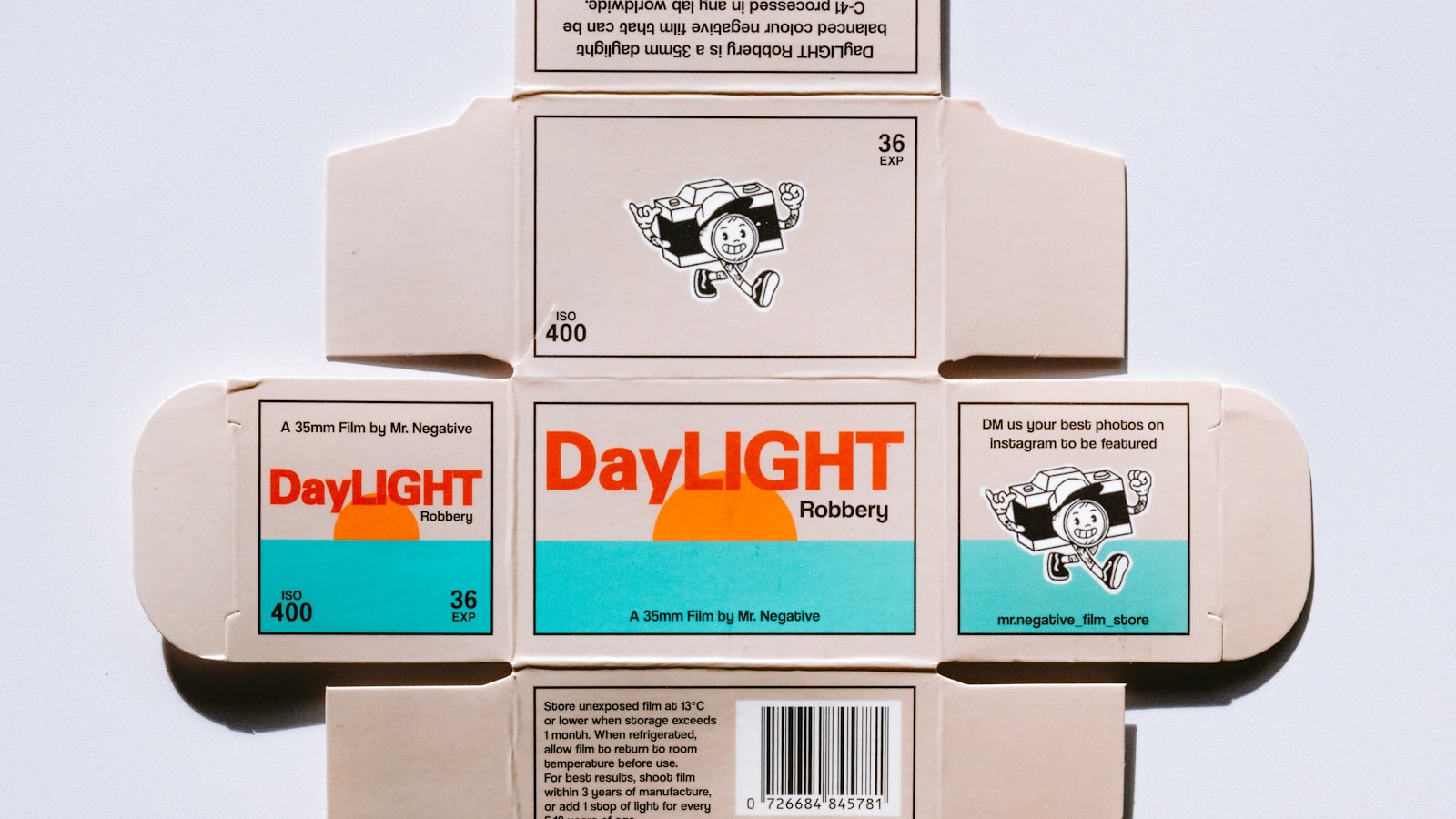
Pl. 01 Label system, press proof
Pl. 02 Cap band, second sample
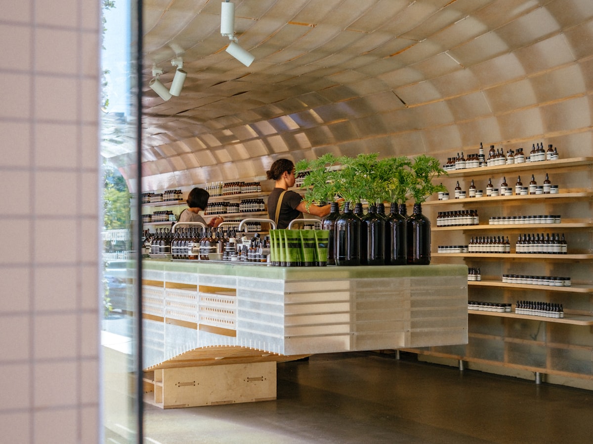
Pl. 03 Shelf test, Naples
Reported by Ferro & Sons after two full seasons on shelf.
14→1
Label designs reduced to a single system.
+19%
Sell-through in independent grocers, first season.
−31%
Print cost per thousand against the previous run.
1958
The jar the whole system was drawn from.
Let's make
something
lasting