( 01 Case study — Dossier )
( In one line )
An independent power company renamed and redrawn so the towns buying from it can tell what it actually sells.
Client
Copperline Energy, Denver
Year
2024
Services
Naming
Brand identity
Duration
Ten weeks
( Scope )
Naming
Brand identity
Messaging
Signage
Vehicle livery
( Team )
Partner, strategy
Designer
Writer
( Talked to )
Nineteen customers and eleven field crews, none of whom used the company’s own words for what it does.
( Elsewhere )
Copperline sold wind and solar to towns that had bought power from the same utility for sixty years. In every material, it looked exactly like the utility it was competing with.
Customers could not name a single difference. Neither, in interviews, could half the sales team.
The name came out of the field crews’ vocabulary rather than the board’s. Copperline is what the linemen already called the ridge route, and the identity is built on things a customer can point at: the pole, the meter, the bill.
One mark, two colours, and a rule that every number the company publishes has to be checkable on the customer’s own statement.
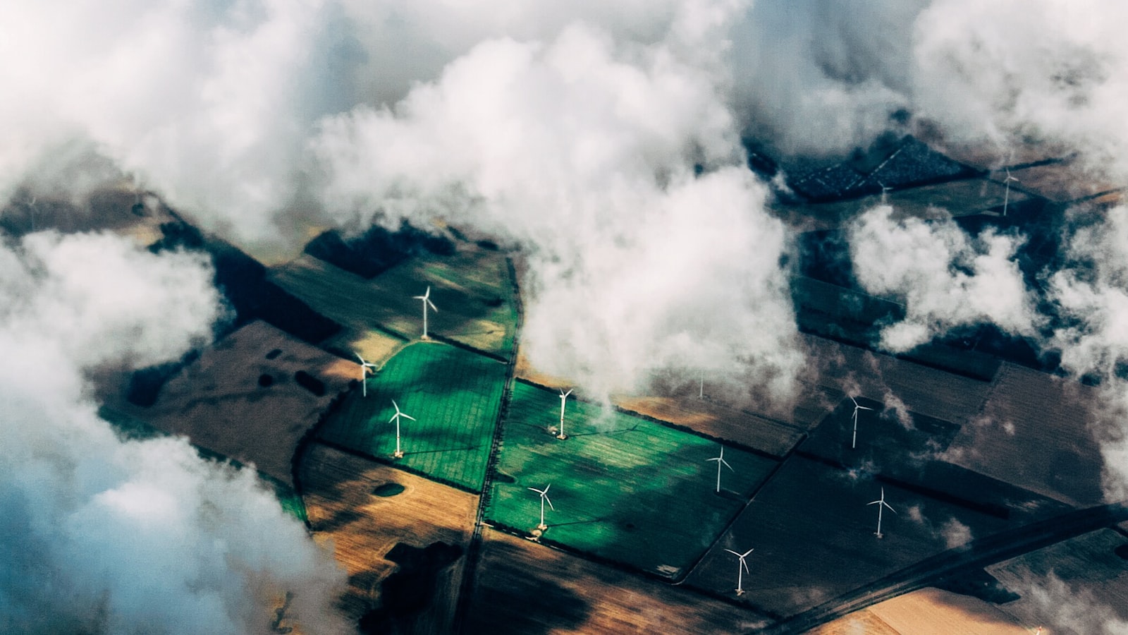
Pl. 01 Wind route, Ridgeway
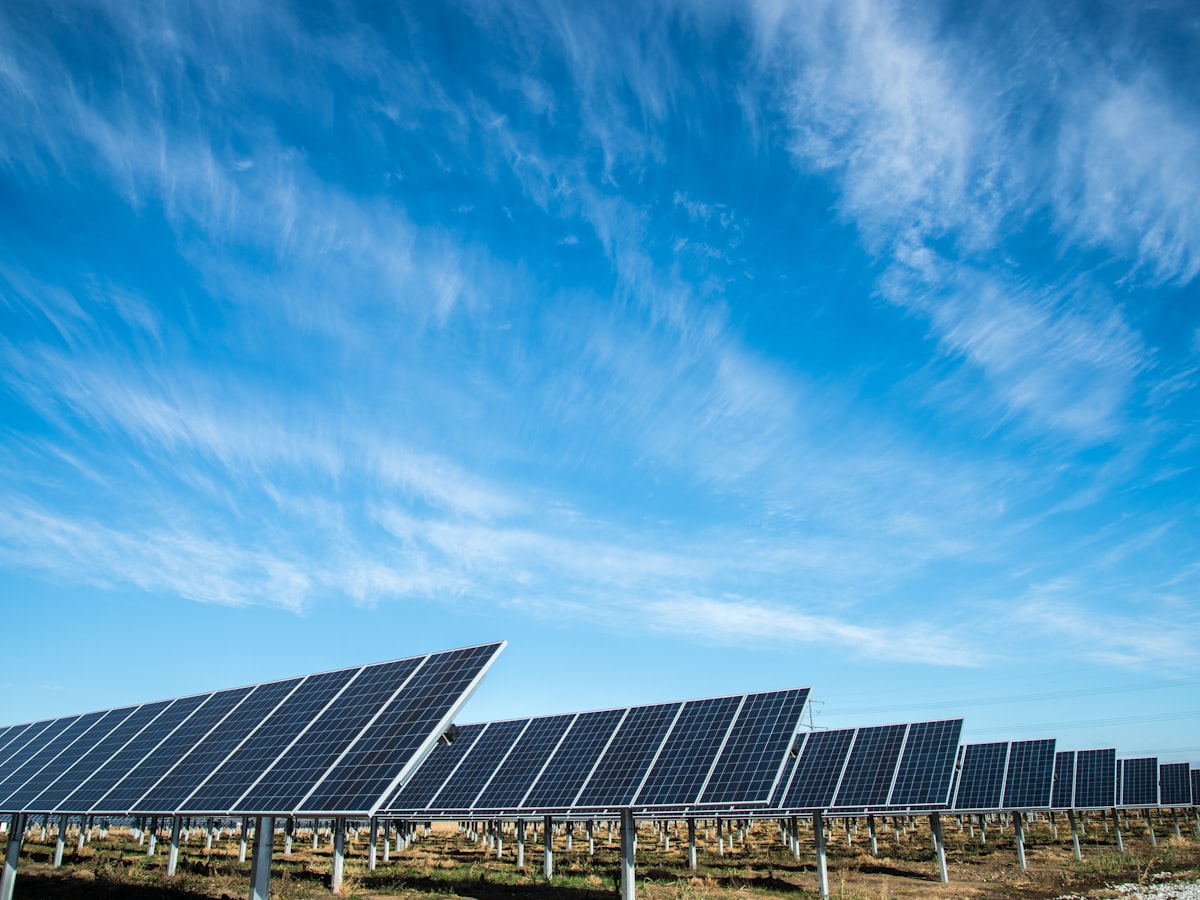
Pl. 02 Array signage proof
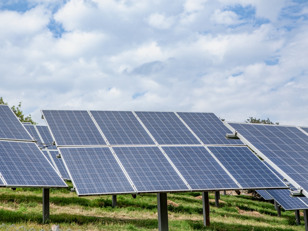
Pl. 03 Livery test, field crew
Reported by Copperline at the first-year review.
+27%
Residential sign-ups in the four quarters after launch.
−52%
Billing questions reaching the call centre.
11
Towns carrying the identity on their own signage.
2
Colours in the entire system, livery included.
Let's make
something
lasting