
( 01 Case study — Editorial )
A savings platform rebuilt around the one screen customers actually open: what they hold, and what it did this month.
Client
Ninefold, Toronto
Year
2021
Services
Web platform
Design system
Sector
Finance
Consumer savings
Duration
Twenty weeks
May – Sep 2021
Team
Partner, product
two designers, researcher
Ninefold had stacked eleven years of features on top of a dashboard nobody used. Ninety-one percent of sessions ended on the balance screen, and the balance screen was the one screen never redesigned.
Every internal proposal was for something new. The research kept pointing at the thing already there.
We deleted more than we added. The balance screen became the product: what you hold, what it earned, what it cost, in that order, in the language the statement already uses.
Everything else moved behind it. Nine top-level sections became three, and the features that survived are the ones customers went looking for by name.
The best thing we shipped that year was a deletion.
Priya Raghunathan — Chief Product Officer, Ninefold

Pl. 01 Balance screen, final build
Pl. 02 Navigation test, third round
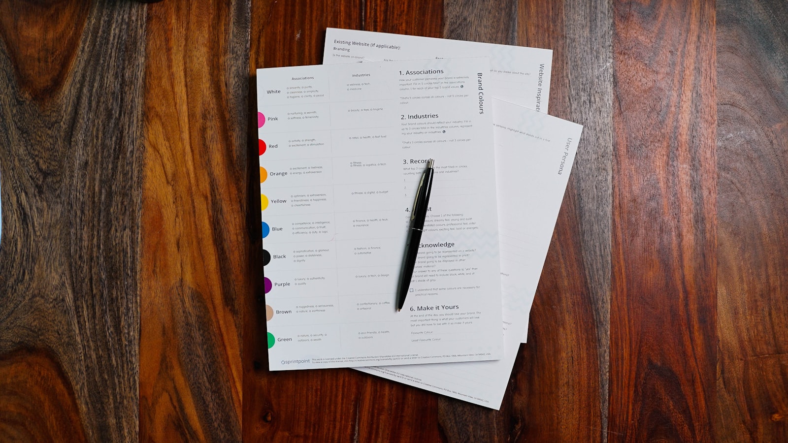
Pl. 03 Statement language review
The rebuild shipped in one release rather than progressively, on the reasoning that a half-deleted navigation is worse than either version.
( 02 Ninety days later )
9→3
Sections
Top-level navigation reduced after the rebuild.
+31%
Deposits
Monthly deposits per active customer, first two quarters.
91%
One screen
Sessions that end on the balance screen, before and after.
0
New features
Features added during the rebuild.
Let's make
something
lasting