
( 01 Journal )
Product
22 Apr 2026
7 min read

Mira Okafor
Design Lead, Product
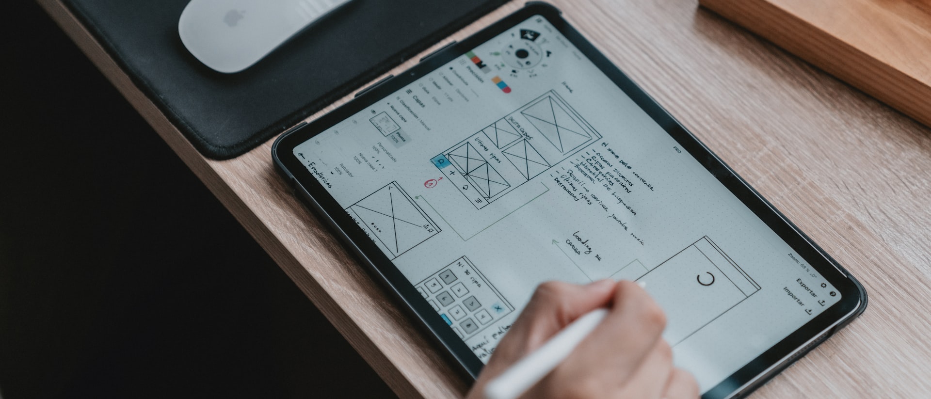
Pl. 01 Week-two prototype on the device it ships to
The earliest useful thing is usually ugly. We get it in front of real users before the design has an opinion, and this is what that costs.
Week two is early enough that nobody is attached to anything. That is the whole argument. By week six a prototype is a position, and testing it becomes a defence rather than a question.
What we build in week two is deliberately unfinished — grey boxes, real words, one path through.
The one thing we never fake is the copy. Placeholder text hides the hardest problems in a product: the label that is four words too long, the error message nobody can act on, the empty state that assumes the user already understands the model.
Everything else can be crude. What the week-two build has to do is narrow:
One complete path, start to finish, with no dead ends
Real language, including the parts legal will object to
Runs on the device it will actually be used on
Throwable — no code anyone will argue to keep
The last one matters most. A prototype that becomes the foundation stops being a question and starts being a commitment.
If it is too nice to throw away, it was made too late.
Product team note
Five people, none of them from the client’s product team. On a logistics tool last year that meant two dispatchers, a driver, a depot supervisor and a temp who had been in the job for nine days. The temp found the most, which is usually how it goes.
We do not run these as formal usability sessions. There is no script beyond a task and a request to think out loud, and we do not correct anyone. The first session generally ends early because the thing breaks, and that is a result rather than a wasted afternoon.
On that project week two told us the entire mental model was wrong — dispatchers thought in vehicles, the prototype thought in orders. Discovering that in week two cost four days. In week ten it would have cost the release.
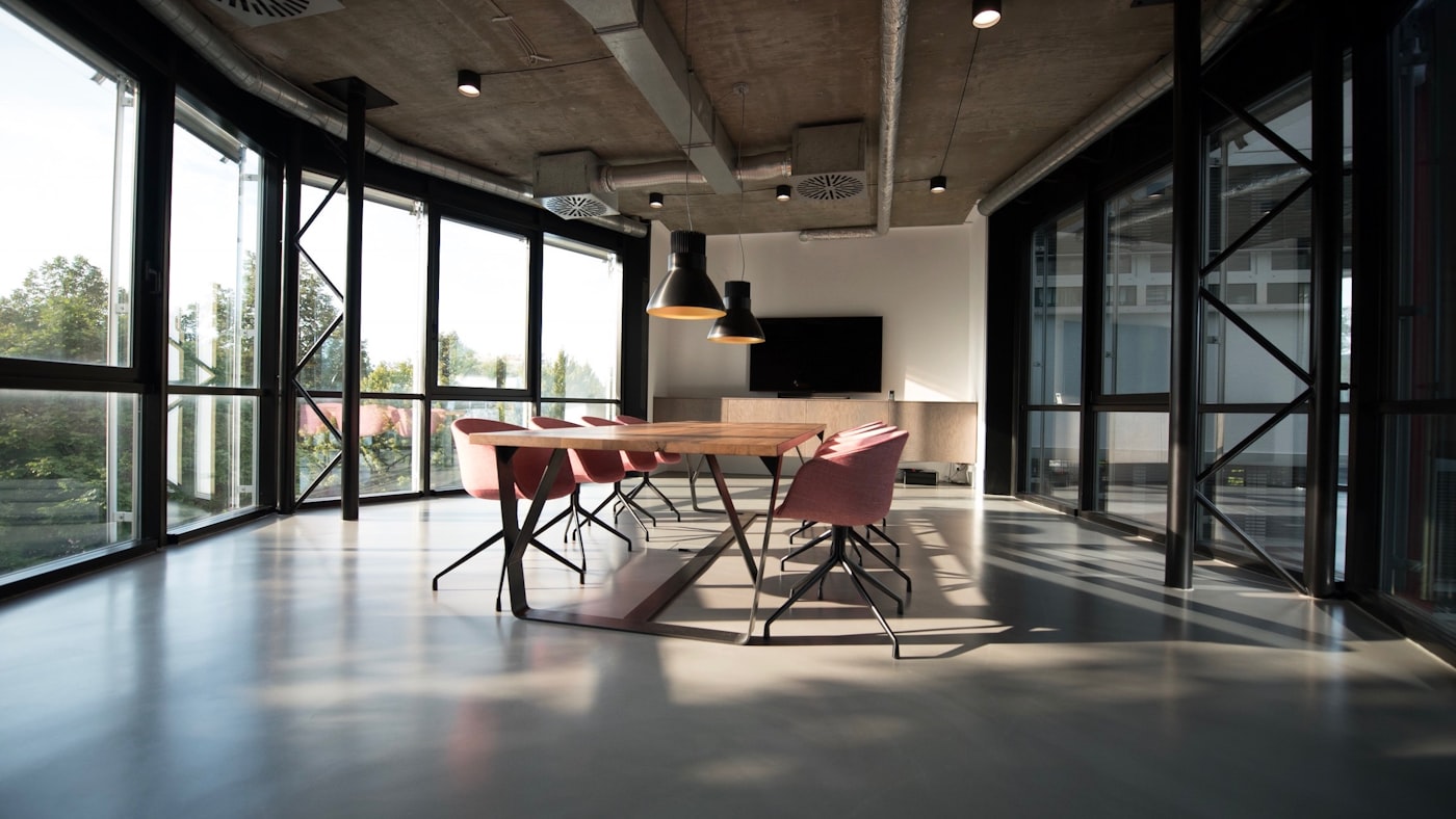
Pl. 02 Week-two build, first session
It looks like a delay and behaves like the opposite. The design phase gets shorter every time, because the arguments that usually happen in review have already been settled by watching someone fail at a task.
The visible cost is that the client sees something crude in the second week of an expensive engagement. We now warn them in the proposal and show a photograph of a previous week-two build, which does more than any explanation.
Include the client in the sessions from the first one, not the second. A team that watches a user struggle needs no persuading later, and a team that reads it in a summary always does.
Filed under Product · 22 Apr 2026
Let's make
something
lasting