
( 01 Case study — Editorial )
Northbeam moved freight for thirty years under twelve regional names. We gave it one, and a system its drivers use without being asked.
Client
Northbeam Freight, New York
Year
2026

Services
Brand strategy
Visual identity
Sector
Logistics
Nine countries
Duration
Fourteen weeks
Jan – Apr 2026
Team
Partner, strategist
two designers
Twelve companies had been bought over eighteen years and never introduced to each other. A shipper in Rotterdam dealt with three of them and believed they were competitors. Internally, nobody could say what the group was for beyond the fact that it owned trucks.
The board wanted a name. What they needed first was a sentence everyone could finish the same way.
Six weeks of interviews at depots rather than head office. Drivers and dispatchers described the business more precisely than any strategy deck we were handed, and one line from a night dispatcher in Newark became the position: the load arrives when we said it would.
The identity is built around that promise being checkable. A single mark, one typeface, and a numbering system that runs from the trailer door to the invoice. Nothing decorative survived the depot test.
We stopped selling reliability and started publishing it.
Elin Mardal — Chief Executive, Northbeam
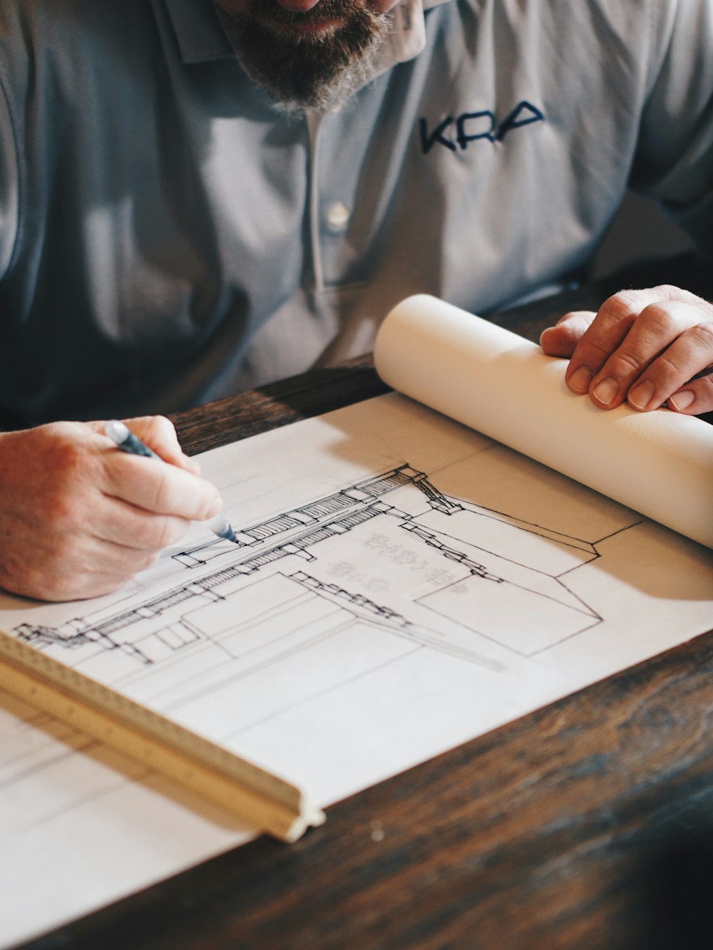
Pl. 01 Numbering system, first proof

Pl. 02 Stock tests for exterior vinyl
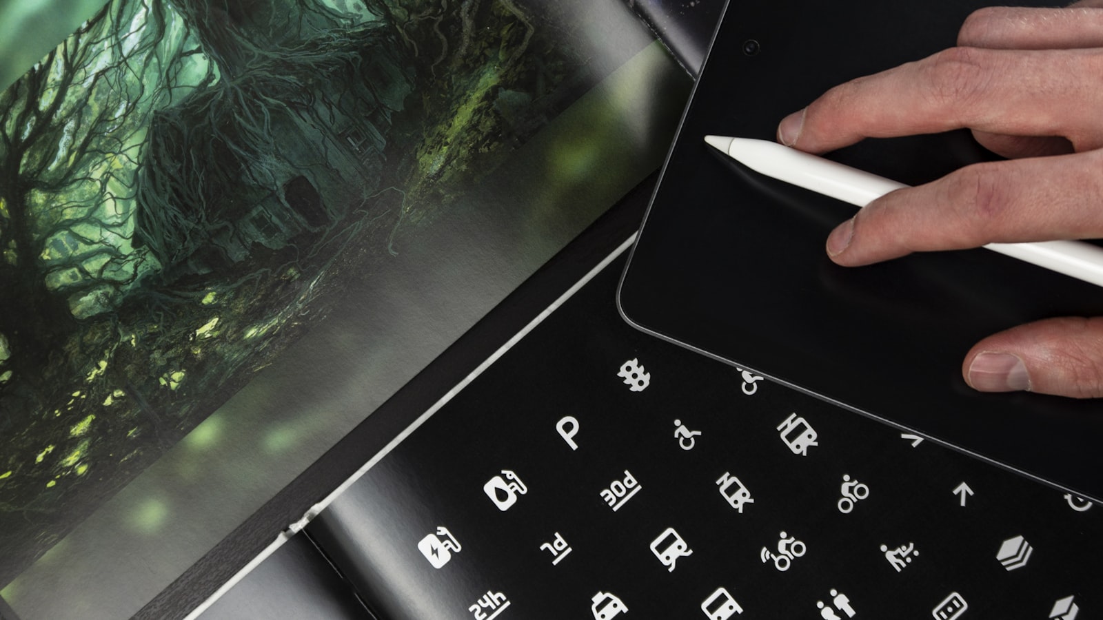
Pl. 03 Dispatch interface, Newark
The rollout ran depot by depot over five months, with the fleet repainted on its existing service schedule rather than off the road. At the ninety-day review, enquiries were up thirty-eight per cent and the group had stopped quoting against itself.
( 02 Ninety days later )
+38%
Enquiries
Qualified enquiries across the two quarters after launch.
12→1
Names
Regional trading names folded into one operator.
5 mo
Rollout
Fleet repainted on the existing service schedule.
0
Internal briefs
Marketing requests for a logo exception since launch.
Let's make
something
lasting